The Market That Prices Every Elon Musk Tweet
28th July 2026
Elon Musk posts a tweet. Somewhere else on the internet, a collection of prices moves.
Not the price of Tesla. Not Dogecoin. A set of contracts on the number of times Musk will post before a clock runs out.
These are Polymarket's tweet markets. A typical event asks how many times @elonmusk will post over the next two days or seven days. Instead of offering one over/under line, the market divides the possible final count into bands: fewer than 40 posts, 40–64, 65–89, 90–114, and so on. Each band is a separate Yes/No market.
If the 90–114 Yes contract trades at 40 cents, the market is roughly assigning a 40% probability to the final count landing in that interval. The winning Yes contract ultimately pays $1 and the others pay $0. As with other Polymarket markets, those prices are not set by Polymarket. They emerge from traders posting and taking orders.
That makes the collection of band prices something more interesting than a bet. Taken together, they form a live probability distribution for a counting process.
And every new tweet changes that process.
A Probability Distribution With A Clock
Suppose Musk has posted 70 times, 24 hours remain, and the market assigns most of its probability to 90–114. A new post does two things at once:
- It mechanically increases the count from 70 to 71.
- It supplies information about the current posting rate.
The first effect is certain. The second is statistical. A single tweet after six hours of silence means something different from the fifteenth tweet in ten minutes. Bursts suggest that the near-term arrival rate has risen; silence suggests the opposite. Time of day, day of week, current news, and Musk's tendency to post in clusters all affect the distribution of the eventual total.
In modelling terms, the final tweet count can be written as:
where is the number of observed tweets and is the unknown number still to arrive before the market closes. At any moment, the fair value of band is:
The entire trading problem is hidden in : everything known at time , including the current count, remaining time, recent posting intensity, seasonality, and the market's own prices.
This is why tweet markets are such an unusually clean laboratory for studying information. The fundamental event arrives with a public timestamp. Its immediate mechanical effect is known. The market's reaction is observable in the trade tape.
Watching Probability Move
The chart below shows one 48-hour market from 22 June to 24 June. Musk posted 106 times, so the 90–114 band eventually won. The upper panel shows each tweet as a vertical line and the cumulative count in orange. The lower panel shows the last traded price of every Yes contract.
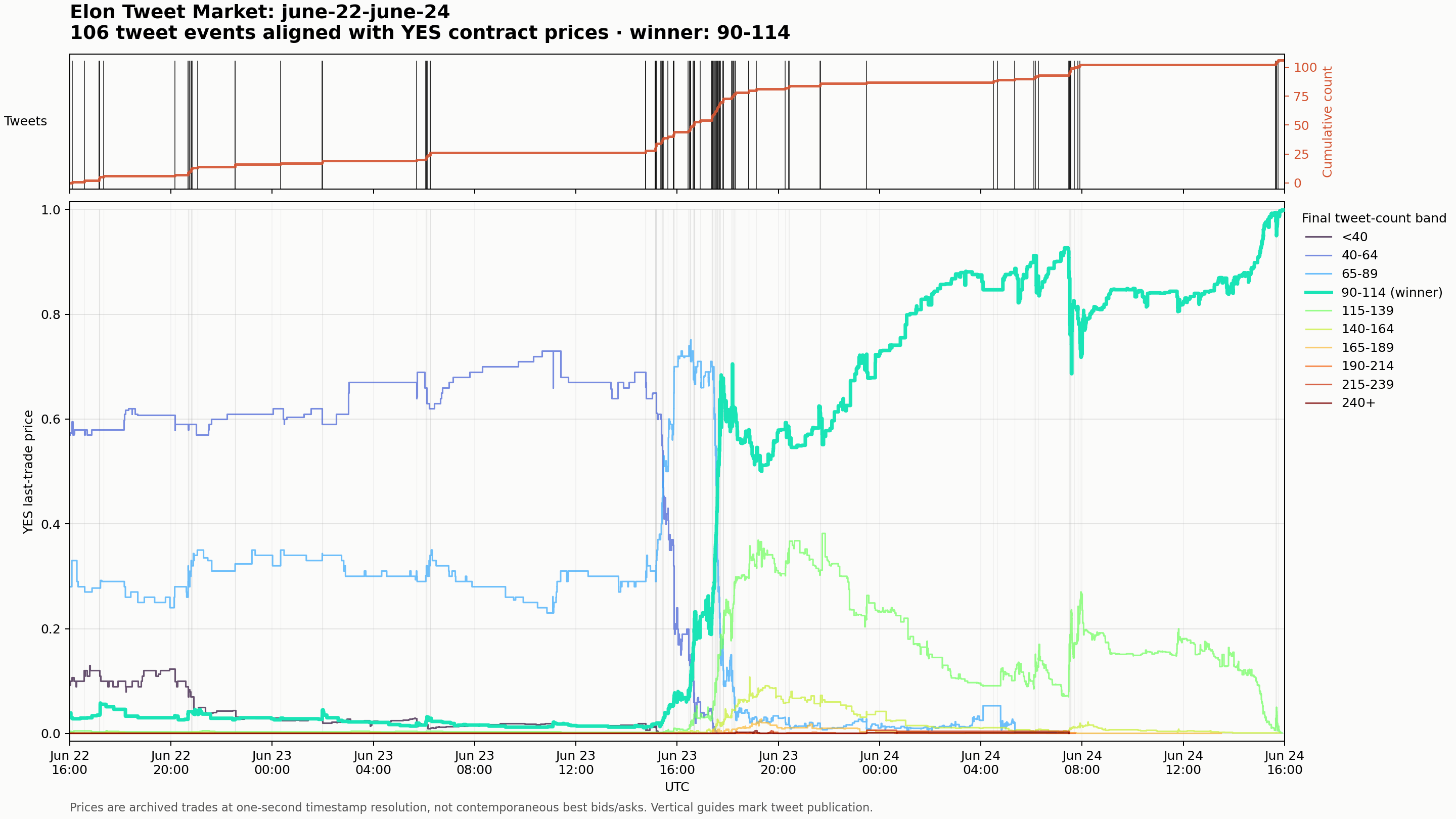
At the beginning, the market favoured 40–64. The count then accelerated sharply during a dense burst on 23 June. Probability flowed out of the lower bands and into 90–114 and 115–139. The winning 90–114 contract moved from almost nothing to around 60 cents during the burst, then climbed toward certainty as time expired.
The important feature is not simply that prices moved in the correct direction. It is the shape of the repricing.
A tweet does not just add value to every higher band. Probability mass travels across adjacent intervals. Once the observed count makes a low band impossible, its price collapses to zero. Bands immediately above the current trajectory gain probability. Very high bands can gain during a burst and then lose again if the posting rate slows. Near expiry, the distribution narrows until one contract converges to $1.
Across the historical sample, I aligned 17,341 counted posts with subsequent trades. The median first strictly later trade arrived about 4.1 seconds after publication. A strictly later fill was visible within five seconds for 53.5% of posts, within ten seconds for 59.5%, and within one minute for 74.4%.
Those numbers need a precision warning. Historical Polymarket fills have one-second timestamps. Tweet publication time can be reconstructed to the millisecond from X's post IDs, but trades within the same second cannot be reliably ordered. I excluded same-second fills from the strict latency calculation. This archive can support a one-second event study; it cannot prove a 100-millisecond trading edge. That requires recording the live order-book feed prospectively.
Still, the broad result is clear: the market reacts in seconds, not instantly.
How Large Are Tweet Markets?
I collected 106 canonical Elon Musk tweet-count events overlapping the period from 17 March to 28 July 2026. The archive contains 2,956,670 public fills and approximately $155.0 million of executed notional. Ninety-eight events were resolved at the time of analysis; eight were still open snapshots.
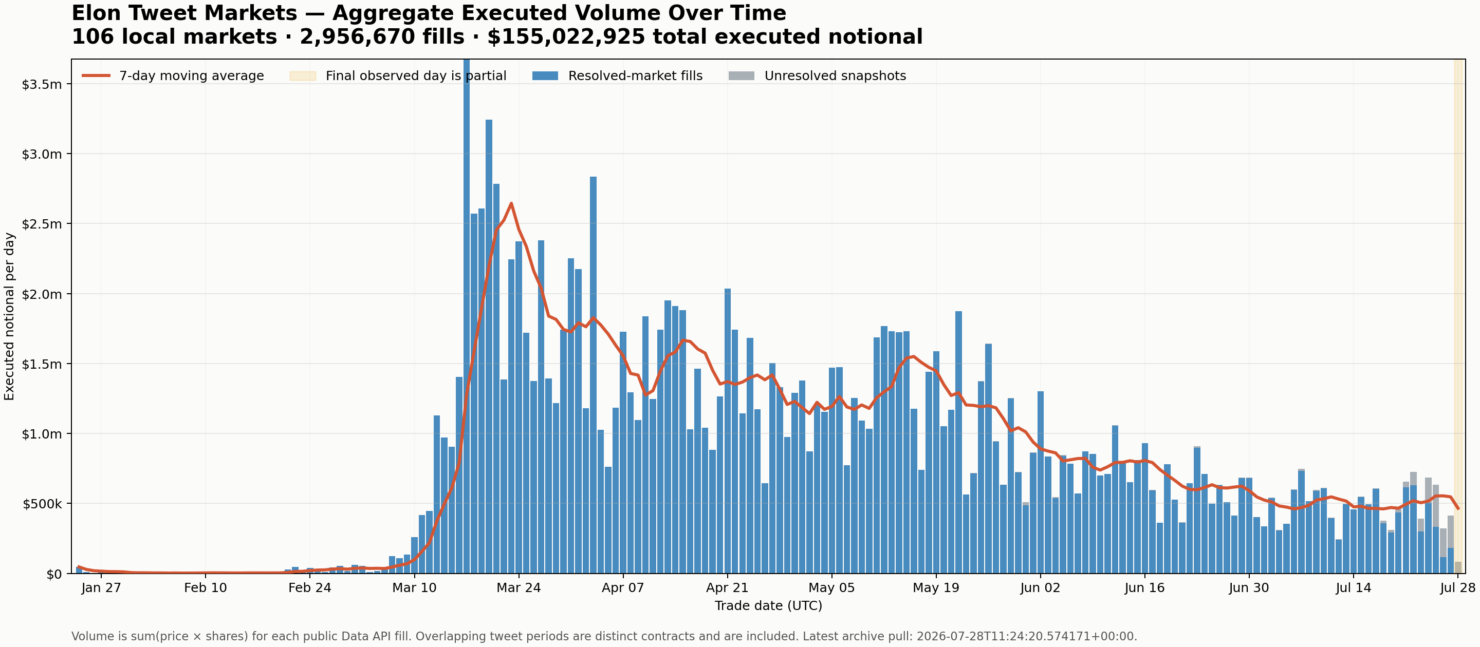
Daily turnover regularly exceeded $1 million through late March, April, and May. The peak day, 17 March, recorded approximately $3.68 million. Activity softened through June and July, but the apparent collapse on 2 June in the first archive was a discovery error: after recovering the omitted overlapping contracts, that day contains $1.30 million across 22,264 fills.
This is aggregate executed notional, calculated as trade price multiplied by shares. Overlapping counting windows are separate contracts and are included separately. In other words, a two-day market and a seven-day market can both react to the same tweet—and both can trade meaningful volume.
The scale changes how the market should be understood. This is not a novelty contract with a few people guessing at a celebrity's social-media habits. It is a repeated microstructure game with enough turnover to attract specialised traders, automated execution, and passive liquidity.
Does The Market Know The Answer?
The market begins with a broad forecast and gets progressively more accurate as tweets arrive and time disappears.
For 97 resolved events with usable price snapshots, I normalised the last traded Yes prices across bands and asked whether the highest-priced band ultimately won. One additional resolved event had no trades before its counting window closed and could not be scored.
| Snapshot | Correct top band | Mean probability on winner |
|---|---|---|
| Start of counting window | 28.0% | 22.7% |
| 24 hours before close | 53.6% | 42.2% |
| 6 hours before close | 75.3% | 66.3% |
| 1 hour before close | 89.7% | 82.3% |
| 10 minutes before close | 97.9% | 94.8% |
The improvement is dramatic, but not mysterious. As rises and the remaining interval shrinks, fewer final bands remain plausible. By the last ten minutes, the market is often pricing an almost-observed fact rather than a long-horizon forecast.
The interesting region is earlier, while several bands remain alive. At the start, the market chose the eventual winner less than one-third of the time. Even 24 hours before resolution, the leading band was wrong in nearly half the sample. Those are the periods in which a better arrival-rate model could matter.
This test also uses last trades rather than simultaneous executable quotes. Thin bands can be stale, and Yes prices do not always sum exactly to one. I normalised the curve for scoring, but a trader would still have to cross a real spread and obtain a fill.
Who Trades These Markets?
I reconstructed both sides of the trade records for 1,806 complete binary conditions across the 98 resolved events. Thirteen unusually active conditions hit the public API's pagination cap and were excluded from the participant analysis. The remaining sample contains 93,740 wallets.
For each wallet, I measured how much executed share volume was passive—resting orders that supplied liquidity—versus aggressive—orders that took an available price. I then valued every execution against the final settlement:
where is the number of shares, is the execution price, and is the final settlement value of zero or one.
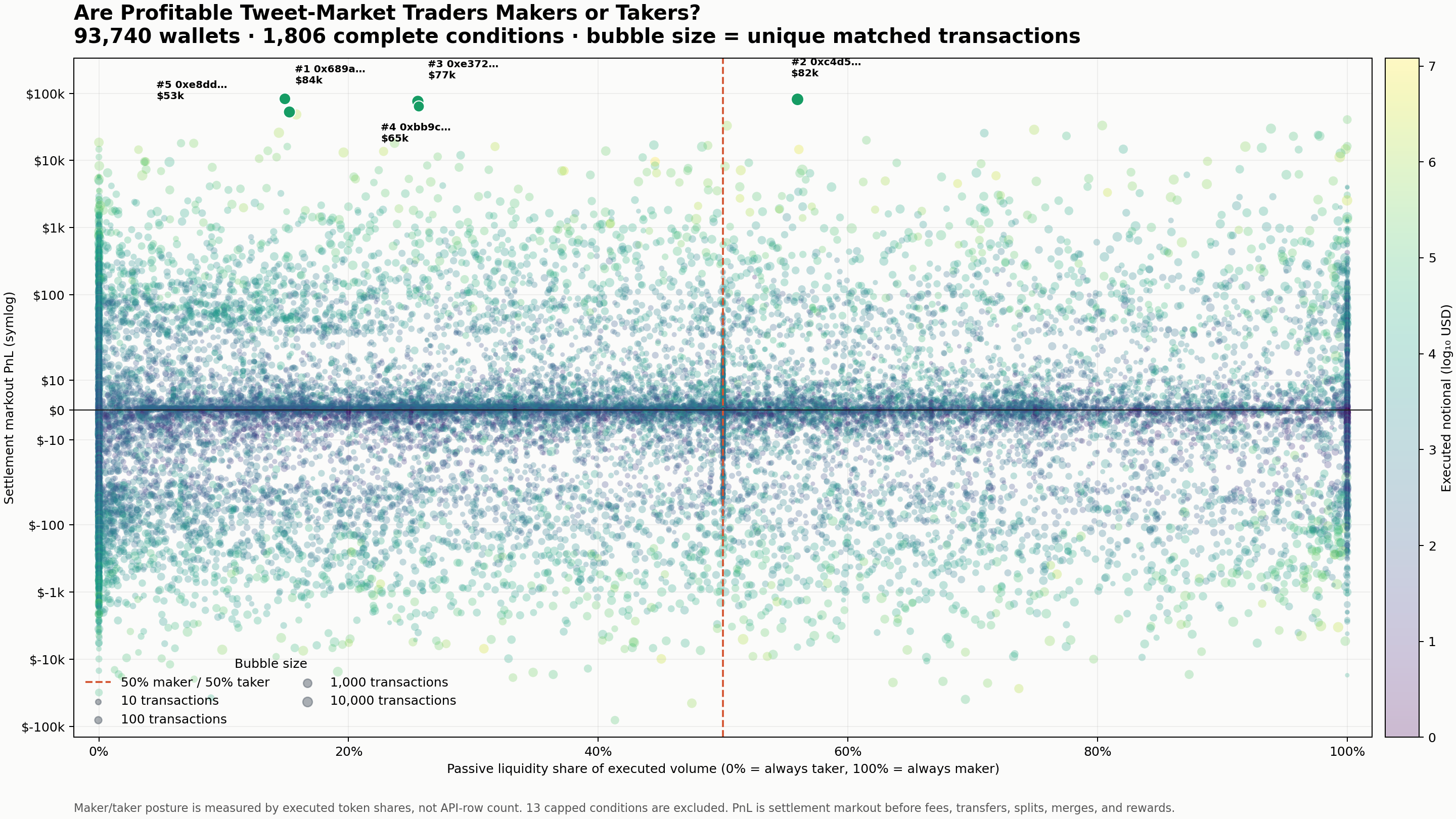
The horizontal axis runs from pure taker on the left to pure maker on the right. The vertical axis is settlement markout on a symmetric logarithmic scale; bubble size represents the number of matched transactions. The dashed line marks a 50/50 passive-aggressive split.
There is no single winning posture. Profitable accounts appear on both extremes:
- The top-ranked account was mostly a taker, with about 15% of executed share volume passive.
- The second-ranked account was close to balanced, with approximately 56% passive volume.
- The third, fourth, and fifth accounts were also taker-heavy, with roughly 15%–26% passive volume.
Across the full market, passive and aggressive executed share volume was almost perfectly balanced: 50.2% maker and 49.8% taker. This is partly an accounting identity—every trade needs both—but account posture still tells us how a strategy chose to interact with the book.
The dispersion in outcomes is enormous. Most wallets cluster close to zero, while a small number sit tens of thousands of dollars away in either direction. Profit does not belong exclusively to forecasters or market makers. Some accounts appear to earn by quickly taking stale prices after information arrives; others appear to earn by continuously offering a distribution and collecting spread while managing inventory.
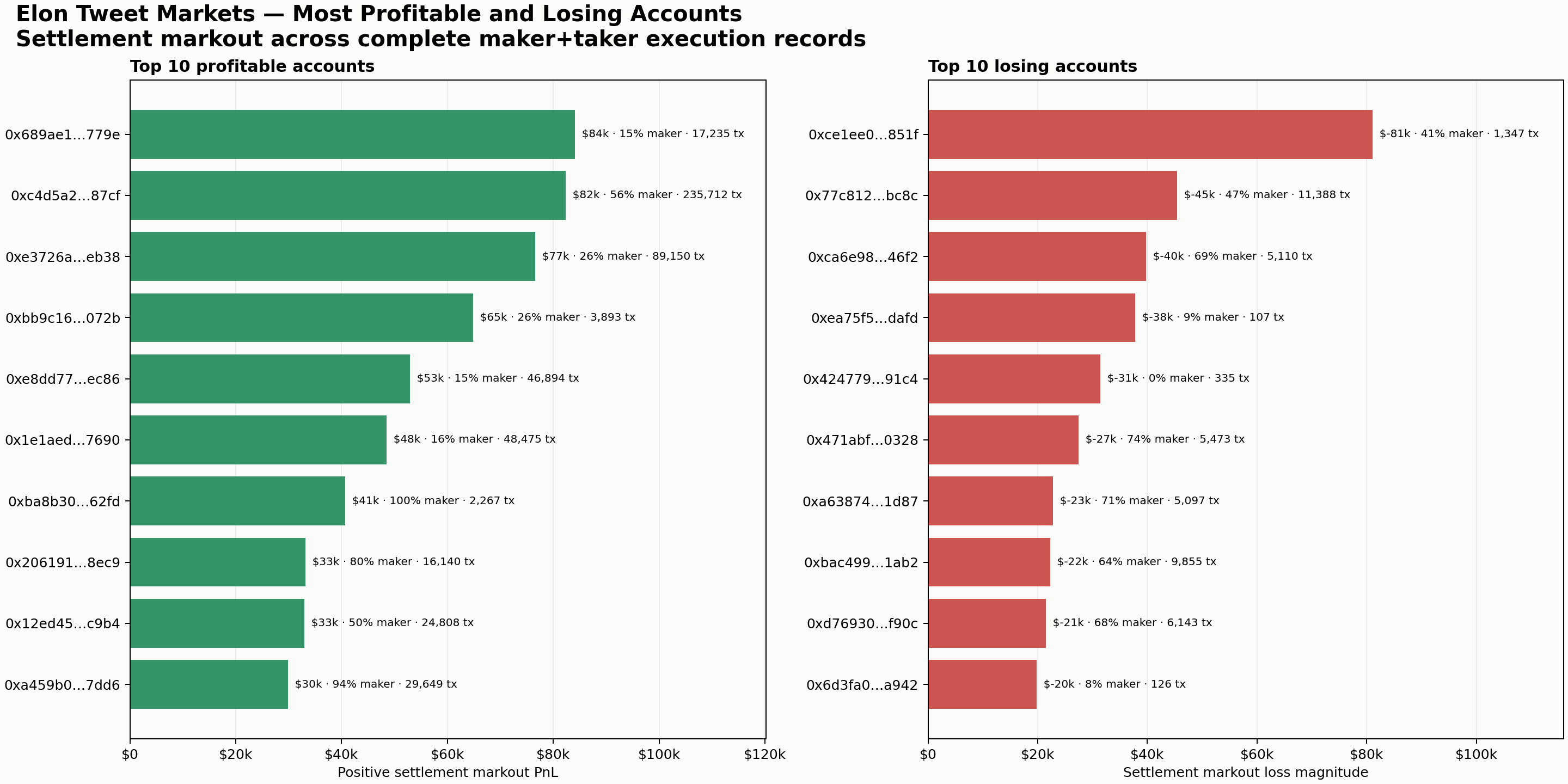
Across the complete maker/taker sample, the leading account earned approximately $84,045 of settlement markout while the largest losing account lost approximately $81,110. These are not necessarily two sides of the same trades, and they should not be read as audited wallet profits. They show how far execution prices ultimately sat from settlement for each account's accumulated trades.
What Survives Fees?
The gross ranking overstates the economics of high-turnover accounts. Each market object records the fee schedule that applied to it. For fee-enabled contracts, I used Polymarket's documented taker-fee formula,
rounded to five decimal places per execution. I then estimated daily maker rebates within each complete binary condition using each wallet's share of fee-curve-weighted maker liquidity and the recorded rebate pool. This follows Polymarket's documentation for trading fees and maker rebates.
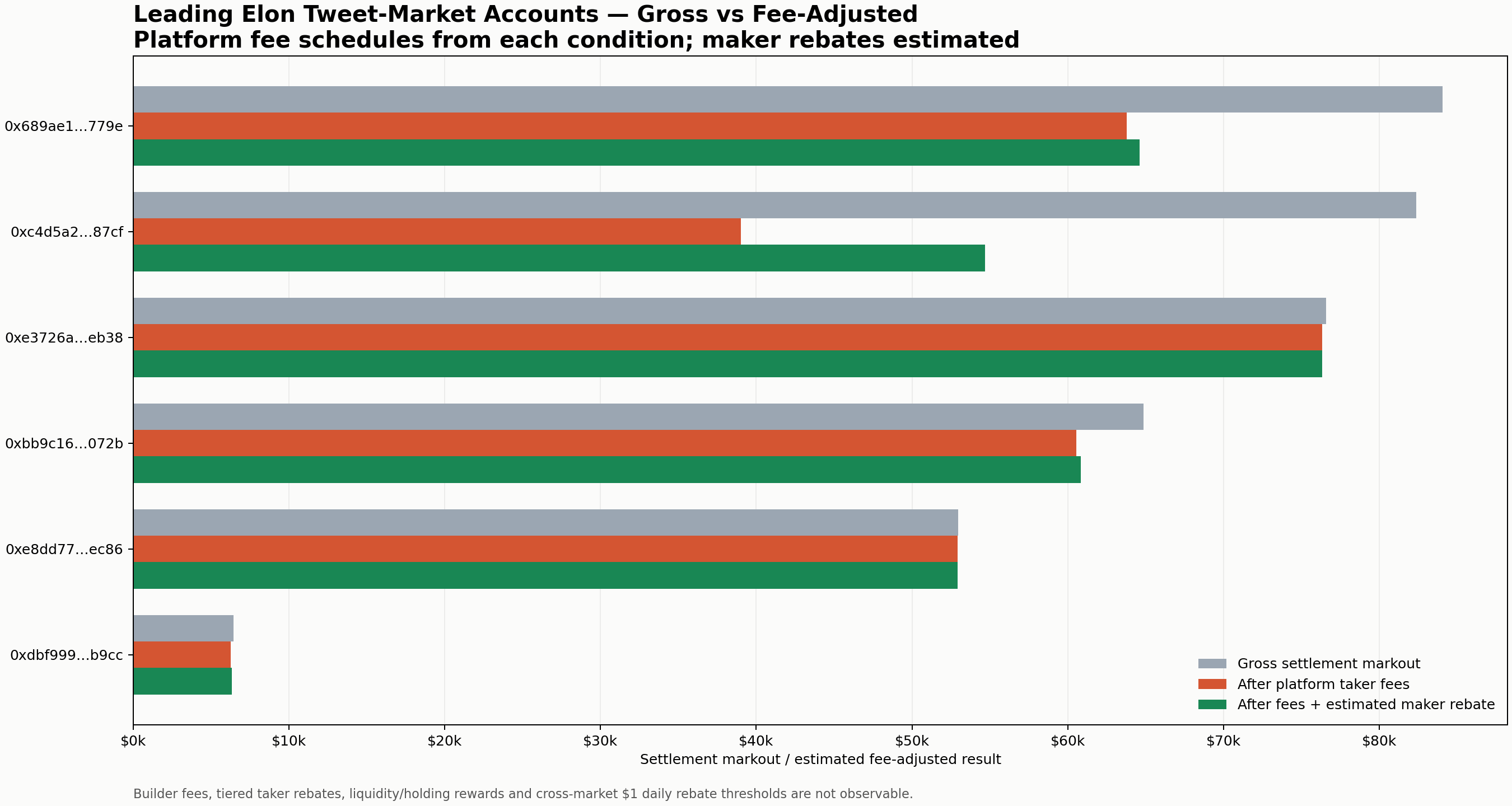
The ranking among these gross leaders changes. 0xe3726a…eb38 has the highest estimated net result in this group at $76,343, down only $237 from its gross markout. The gross leader, 0x689ae1…779e, falls from $84,045 to approximately $64,599 after $20,250 of taker fees and an estimated $804 maker rebate.
The smooth high-turnover account 0xc4d5a2…87cf is the clearest example. Its $82,354 gross markout falls to approximately $54,671 after $43,347 of taker fees and an estimated $15,664 maker rebate. The gross curve was real, but a large fraction of the edge was consumed by repeatedly taking liquidity.
These remain estimates rather than wallet statements. The public archive does not expose builder fees, tiered taker rebates, liquidity or holding rewards, or enough information to enforce the $1 daily maker-rebate payout threshold across every market on Polymarket. The comparison does, however, include the platform fee schedule attached to every complete tweet-market condition.
The Equity Curves Of The Winners
The five most profitable accounts in the maker/taker reconstruction earned settlement markouts ranging from roughly $53,000 to $84,000.
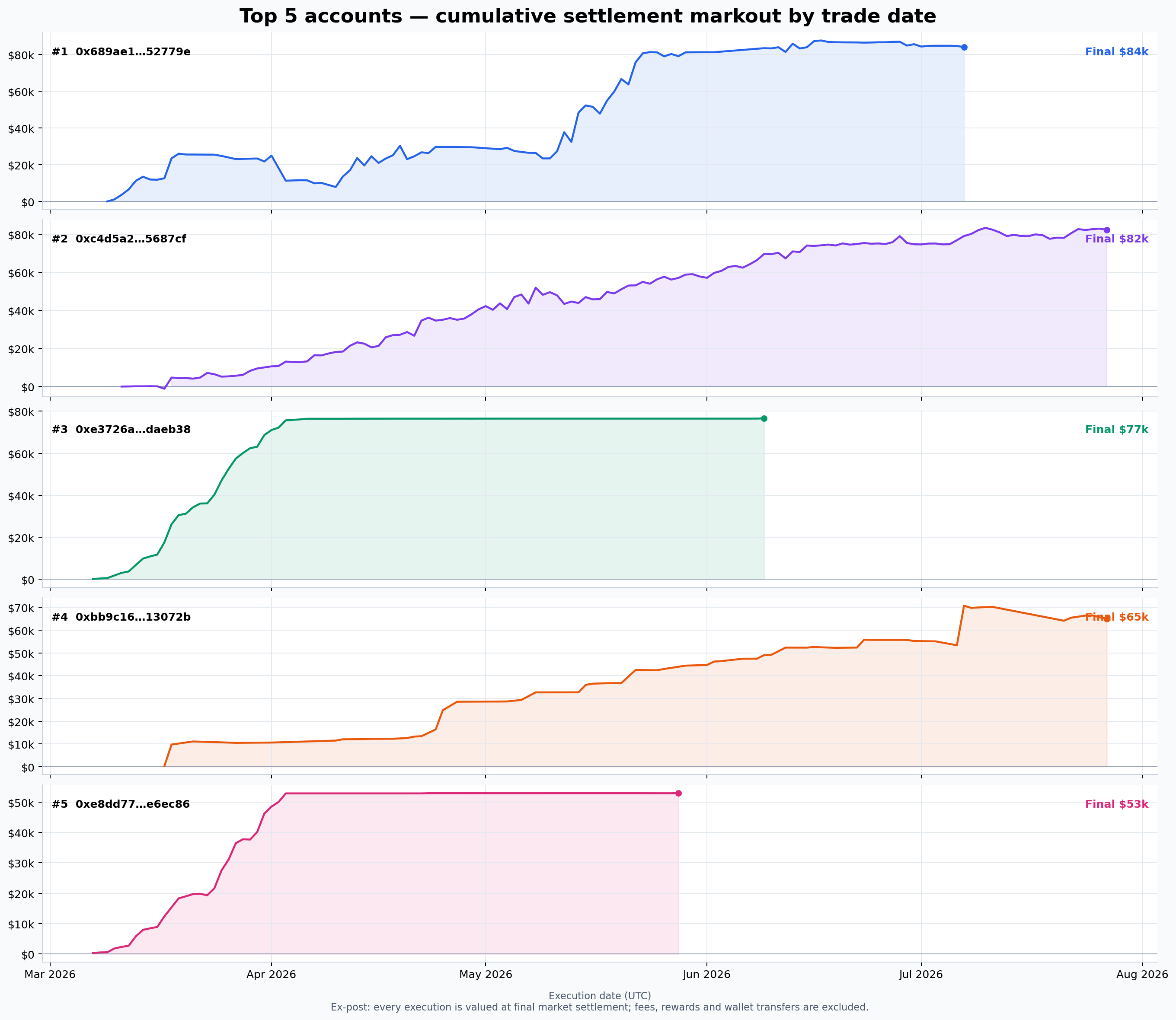
Their paths are strikingly different.
The leading account traded across 62 events and accumulated an $84,045 markout over 97 active days, with its largest gains arriving in mid-May. The second-ranked account was the most persistent high-turnover participant: it traded across 94 events and 139 active days, producing an $82,354 markout from 242,964 execution records.
The third account made most of its $76,581 during March and then stopped changing materially after early June. The fourth accumulated $64,856 in a more stepwise path across 61 events. The fifth produced $52,952 over 46 active days and was no longer active after late May.
These are not wallet-balance curves. Each trade's eventual settlement profit or loss is attributed back to its execution date. They therefore show when the winning decisions were made, not when cash was redeemed. Fees, liquidity rewards, transfers, token splits and merges are also excluded. The measure is best read as ex-post trading markout, not audited accounting profit.
One Market, One Winning Account
The June 22–24 market offers a useful case study because it is the same contract shown in the tweet-and-price chart above. Musk posted 106 counted tweets, so the 90–114 band resolved Yes. All ten binary conditions are complete in the public participant archive: 36,699 maker and taker execution records across 1,920 wallets, with no capped conditions.
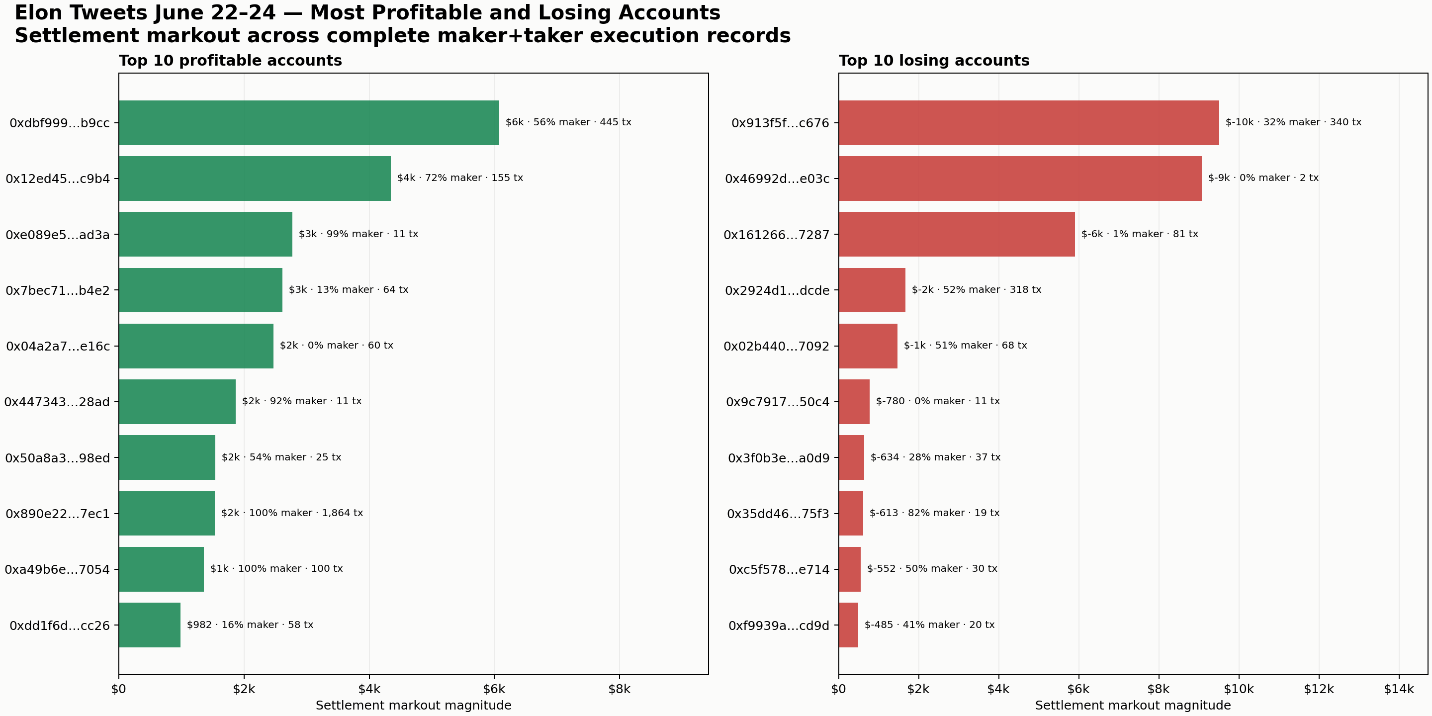
The leading account in this event, 0xdbf999…b9cc, earned approximately $6,080 of gross settlement markout. Its $94.38 of taker fees were partly offset by an estimated $26.65 maker rebate, leaving approximately $6,012 net. The largest losing account, 0x913f5f…c676, lost approximately $9,503 before fees. The winner traded in 445 transactions and was almost balanced in how it accessed liquidity: 56% of its executed share volume was passive.
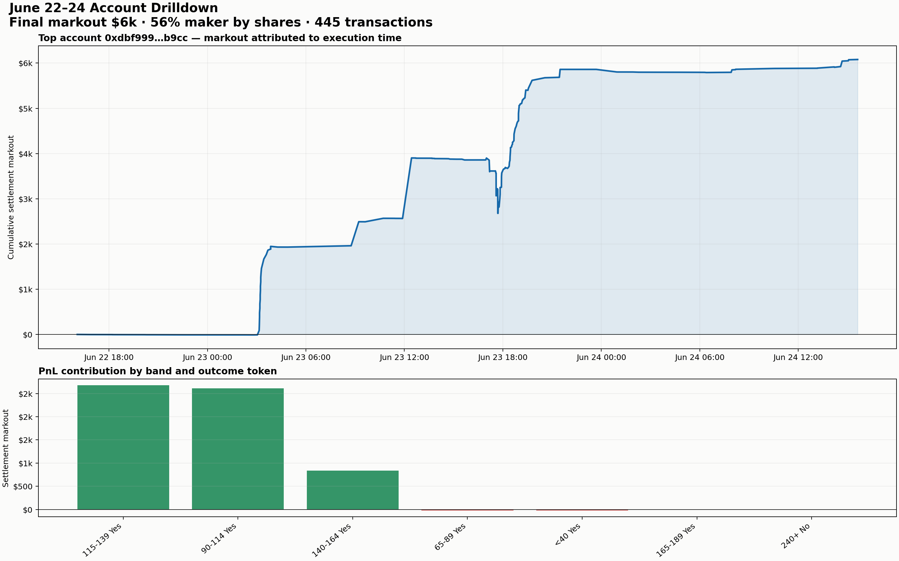
The path reveals a distribution trade rather than a single last-second bet. At 03:02 UTC on 23 June, when only 19 tweets had arrived, the account began buying the eventual 90–114 winner near 2.1 cents. Its passive buys in that band averaged roughly 1.65 cents for 4,000 shares. That band ultimately contributed $2,613, even after the account sold part of the position during the following day's burst.
The account made another $2,677 in the adjacent 115–139 band, principally by selling Yes as its price rose, and $839 from selling the 140–164 band. In total, $4,243 of its markout came from maker executions and $1,837 from taker executions, on $6,980 of executed token notional.
This still is not an audited cash PnL curve. Each execution is marked immediately to the answer that became known at settlement. But it tells us when the profitable decisions were made: first by cheaply accumulating the band that eventually won, then by selling probability in higher bands as a burst pulled the whole distribution upward.
Was this repeatable skill or one fortunate position? The wider record argues for caution. This account earned approximately $6,450 gross across all 24 tweet markets in which it appears. After estimated platform fees and maker rebates, that becomes $6,322. The June 22–24 event supplied $6,012 net—95.1% of its estimated all-market result. Its other 23 markets contributed only about $310 combined.
For comparison, I reconstructed the same event for 0xc4d5a2…5687cf, the smooth high-turnover account from the all-market equity chart. Its full address is 0xc4d5a24a240ec9f52669e3251e0473fd0c5687cf.
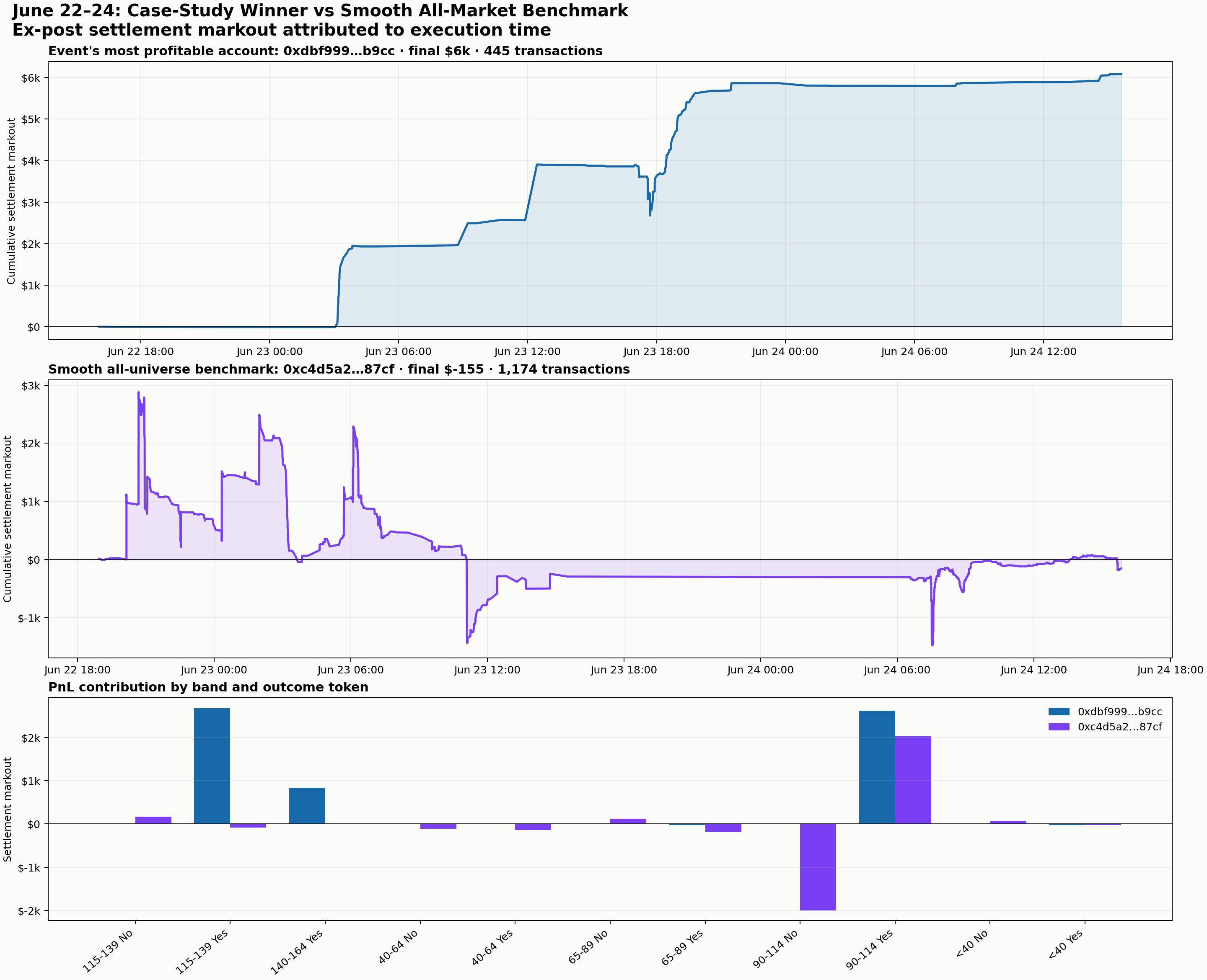
The benchmark traded this event very differently. It executed 1,174 transactions and $39,480 of token notional, moved between approximately -$1,479 and +$2,877 of cumulative ex-post markout, and finished at -$155 gross. Its taker executions made $2,772 while its maker executions lost $2,928. A further $278.06 of taker fees, partly offset by an estimated $63.59 maker rebate, takes the event result to approximately -$370 net.
Even within the winning 90–114 condition, its exposures largely cancelled: the Yes token contributed +$2,027 while the complementary No token contributed -$2,000. This looks less like a settled forecast of the final count and more like continuous repricing and inventory turnover.
The comparison does not prove that the case-study winner was lucky. It does show that almost all of that wallet's measured edge came from one market, while a trader with a much smoother all-market record did not share the same concentrated bet. A credible signal should reproduce across many events, not merely explain the best trade after the fact.
What A Tweet Is Worth
The core fact of these markets is simple: when Musk posts, every tweet-count band becomes slightly stale.
The new fair distribution can be estimated by shifting the old curve one count to the right, then adjusting it for what the tweet says about the future arrival rate. A robust model would combine:
- the current count and time remaining;
- time-of-day and day-of-week seasonality;
- burst and decay dynamics in recent posting;
- different behavior for two-day, seven-day, and monthly windows;
- the market's pre-tweet probability curve as a prior;
- executable bid and ask prices, rather than last trades.
The market is already doing this collectively. Its prices move toward higher bands after posts, sharpen as the deadline approaches, and become highly accurate near resolution. The opportunity, if one exists, is not predicting Musk's final tweet count in isolation. It is updating the distribution more accurately—and a few seconds faster—than the price currently available on the order book.
That is what makes tweet markets fascinating. They turn an erratic human stream of posts into a live probability surface, then expose every delay in updating it.
The next step is to measure that delay precisely enough to trade.